Charts when you read right-to-left
I follow several Twitter accounts in finance, open government, and education, which often post charts or data visualizations. While exploring Arabic i18n in several other cases, I’ve noticed ambiguity in how to internationalize charts.
Examples where time runs Left to Right
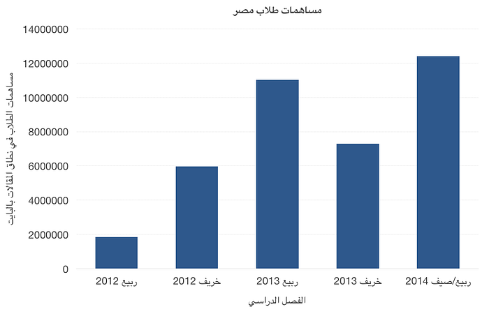
Here’s a recent line chart from a Jordanian education organization. As you can see, all of the labels and numbers are in Arabic, but just like an American startup, the “hockey stick chart” soars up and to the right.

Arabic-language Wikipedia agrees in their articles about bar charts and line charts (Persian-language Wikipedia didn’t use any other graphics).


In December 2020, the World Bank Tweeted out a horizontal bar chart where labels are on the right and length of bar is measured to the left, BUT any line charts in the report represent time from left-to-right.
Examples where time runs Right to Left
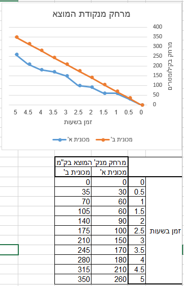
The Hebrew Wikipedia article for ‘line chart’ flips the x-axis, and places the y-axis to the right of the chart. I’ve noticed that this language Wikipedia flips other graphics, such as the solar system, more often than Arabic script Wikis.

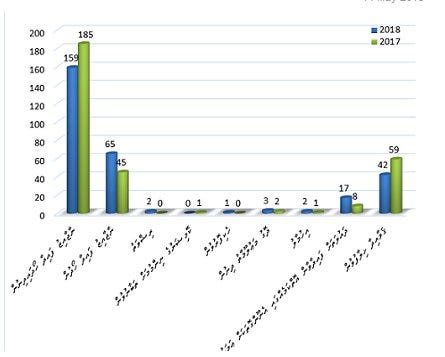
As a more organic, non-Wikipedia example, this Dhivehi-language bar chart by the Maldives Anti-Corruption Commission displays a ‘2018’ bar to the left of each ‘2017’ bar.

The following one isn’t a full line graph, but it shows a downward-trending financial chart as an arrow pointing down and to the left:
I also noticed this graphic in an Arabic/English bilingual report:

By looking at their data visualizations side-by-side, you can see the future year flipped to the left in Arabic, but also:
- order of the categories
- label placement on the leading edge of the bars (English left, Arabic right), with additional changes to fit the new USD suffix text
- arrow sections below the chart (existing/potential market size) change direction
- no change to the stock market icon for Islamic Finance (points right)
Conclusions
It looks as though left-to-right is the more common practice, especially for line charts. It’s tough to say if either direction is correct, because professionals have made different conclusions. I would suggest to check for context and previous experience in your language and region first, and be prepared for lots of small details (and technical hurdles, depending on graphing software) when internationalizing a right-to-left chart.
